An excerpt from my research study on business intelligence systems
DEFINITION
Visualization involves “computer-based visualization systems [that] provide visual representations of datasets designed to help people carry out tasks more effectively” (Munzner 2014). Visuals or graphics such as chart, figures and tables are thought to be the simplest and yet powerful (Tufte 2013) as they use human perception to aid understanding of the underlying dataset. Therefore, to aid understanding and identify patterns, trends and correlation, data is represented with visuals in a process known as data or information visualization. Information Visualization is “the use of computer-supported, interactive, visual representations of abstract data to amplify cognition” Card, Mackinlay and Shneiderman (1999) cited in (Dykes, Jason; Slingsby 2017b).
EVOLUTION OF DATA VISUALIZATION
INTRODUCTION
Data visualization predates the 19thcentury when statistics was increasingly being used for planning in trade and commerce taking different forms as it developed; including map, graphs and later extending into graphics (Friendly 2006).
DEVELOPMENT OF VISUALIZATION ACROSS TIME

As illustrated in Figure 5 above, the earliest development started as ‘graph-like’ tables with point placements representing positions of celestial bodies in an effort at developing maps. These efforts were further developed into measuring physical quantities such as time, distance and space resulting in a table showing distance between cities which was extended into maps and chart. By this time, geometric shapes have been developed and included on the maps (graphs) – marking the beginning of modern graphics which is attributed to William Playfair (Tufte 2013) and coincided with statistical efforts to collect social data such as “wealth, population, agricultural land taxes…as well as insurance and annuities based on life tables”. Around this time, Florence Nightingale launched a bid for improved conditions as she puts it “more deaths occurred from disease and consequence of wounds than from the hands of the enemy”. Her efforts were later developed by Dr. John Snow in producing his famous dot map to highlight the correlation of cholera deaths to the Broad Street pump. There was a dormancy in developing data visualisations, but this dormancy was broken with John W. Turkey’s “Exploratory Data Analysis (EDA)” when he launched a campaign for data analysis to be recognised as a legitimate branch of statistics with effective graphic displays which included stem-leaf plots, boxplots, hanging rootogram, two-way table displays. His efforts saw computer processing of statistical data- shift from its hand-drawn counterparts in early data graphics developments. Close collaborative research work in computer science and statistics started in earnest and would soon see 2D and 3D interactive evolving and blossoming into a wide range of dynamic visualizations for desktop computers (Friendly 2006).
VISUALIZATION STAGES
As visualization aims to aid cognition, it is vital to note the role vision and interaction play. Vision is important because “we acquire more information through vision than through all of the other senses combined” and the acquired information can be translated into cognition as “most cognition is done as a kind of interaction with cognitive tools… and increasingly computer-based intellectual supports and information systems” (Ware 2004). As a result, four basic stages of visualization are identified with Figure 6 illustrating their interrelation:
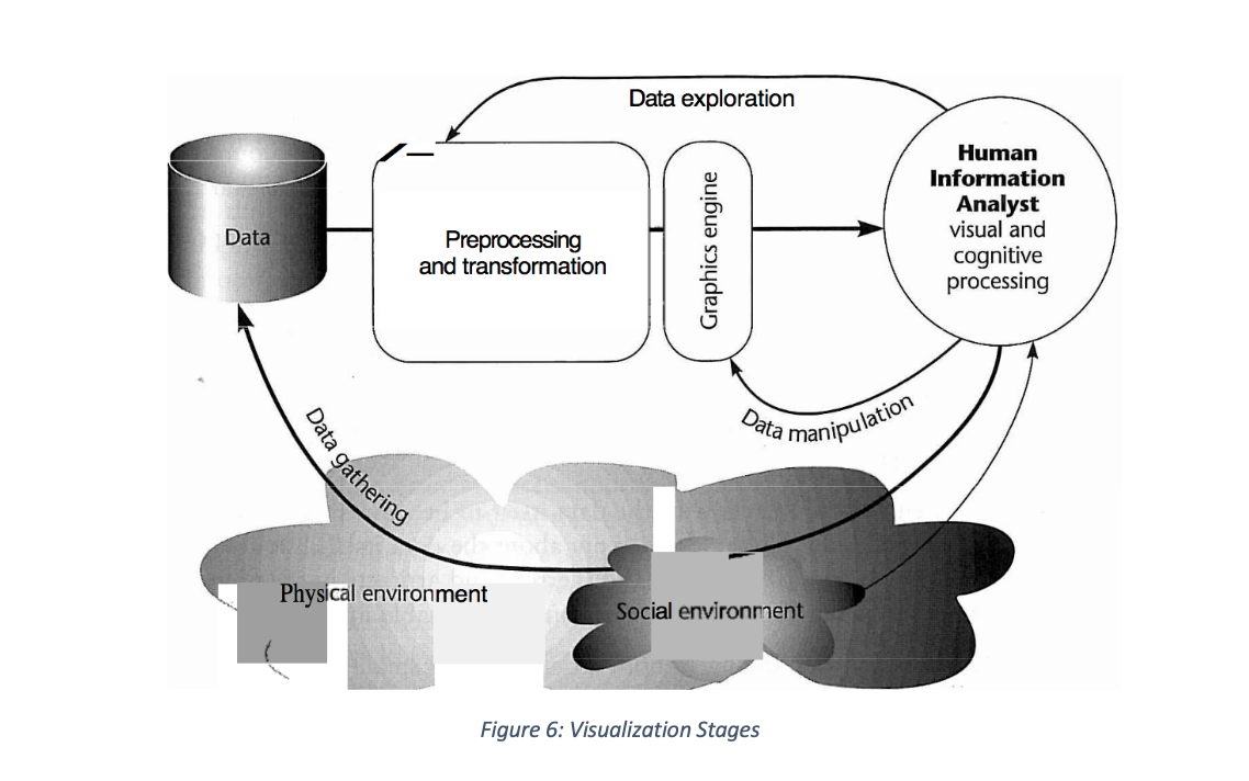
In the above, data collection (first stage of visualization) from the physical environment with social environment providing context, is the core to which transformations and pre-processing (second stage) are applied. The resultant transformation and pre-processing use graphics engines in rendering or displaying (third stage) visualization for interaction (fourth stage) which can take the form of selecting parameters or changing the perspective or position of 3D visualization all aimed at communicating insights.
VISUAL ENCODING
INTRODUCTION
Cognition, as already established, would only be deemed successful if the intended recipient of a visualization can understand the ‘message’ conveyed by a visualization. For this to occur, the design of the visualization must be considered to convey information from given datasets. One way of achieving this, is to present the information in a manner that can be understood by the recipient and as a result, various design principles and perceptions are proposed. A linear process of encoding and decoding based on human visual perception is therefore pursued going forward.
VISUAL COGNITION
It is reported, after a number of studies have been conducted that humans process and perceive visualization in one of two ways: pre-attentive and attentive processing (Nazemi 2016)
PRE-ATTENTIVE PROCESSING
Pre-attentive processing is the type of cognition that allows understanding visuals ‘at a glance’ without a conscious effort (Dykes, Jason; Slingsby 2017b). Visualizations that use visual properties: “length, width, size, curvature, number, terminators, intersection, closure, hue, intensity, flicker, direction of motion, binocular luster, stereoscopic depth, 3D depth cues and lighting direction” as well as visual variables: “luminance and brightness, colour, shape and texture” serve as visual stimuli that tend to gain human attention in less than 250 milliseconds (Ward, Matthew; Grinstein, Georges; Keim 2015). This, Ward et al. regards as pre-attentive processing, also known as ‘pop-out effect’ is associated with performing tasks such as target detection, boundary detection, region tracking as well as counting and estimation (Nazemi 2016). Treisman’s Feature Integration Theory (Treisman, Anne; Gelade 1980)is widely used to test detection of target objects from a sea of detractors. It is evidenced, that “the more an object differs from the detractors, the better it can be processed” and that “a green square, for example, in a sea of red circles can be better recognised pre-attentively than a red square” which was further expanded to include more than one unique visual feature (Nazemi 2016).
ATTENTIVE PROCESSING
Attentive processing which on the other hand requires conscious effort to understand visuals (Dykes, Jason; Slingsby 2017b), is based on Wolfe’s Guided Search model in which he proposes that information from the pre-attentive stage guides the attentive stage (Wolfe 2007). This theory is further developed by Ware who proposes a three-stage model of “pattern recognition, sequential goal-directed processing and pre-attentive processing” (Ware 2004). Visual features “orientation, colour, texture and movement patterns” are associated, with the visual stimuli passed from the pre-attentive stage to pattern recognition where regions and localization are identified leading into sequential goal-directed process which is active attention in nature (Nazemi 2016).
ENCODING
For data visualization to successfully communicate insight, data elements and visual variables need to be carefully chosen and combined in a manner that would take advantage of human processing and perception of visualization. For this reason, a linear process of encoding information for visual transmission and subsequent decoding by the reader is advocated (Iliinsky, Noah; Steele 2011).
VISUAL CHANNELS
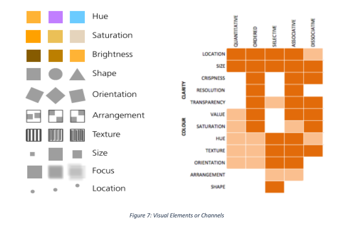
MacEachren (1995) provides a number of visual elements or channels as choice for encoding with suggested usage regards characteristics of variables such as selective, associative, order, quantitative and length in Figure 7.
DATA ELEMENTS
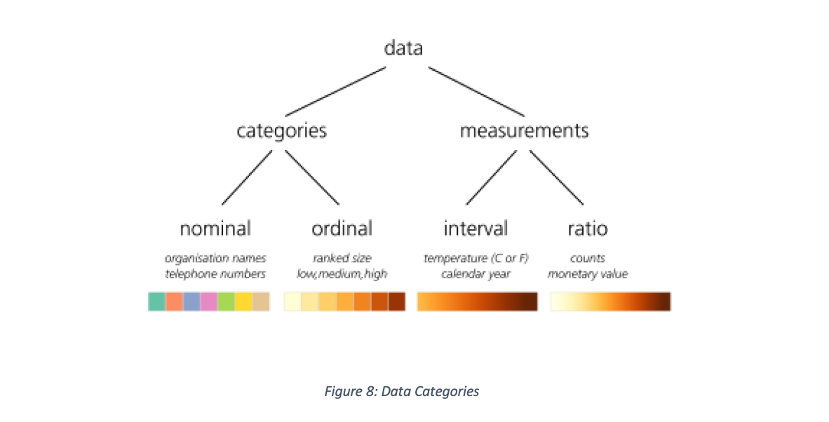
To start, the designer needs to be accustomed with the data, knowing the data elements to be visualized in order to decide which visual elements to use. Data lends itself to being classified as categories or measures with each class further grouped into nominal, ordinal, interval and ratio illustrated in Figure 8 with suggested colour encodings (Dykes, Jason; Slingsby 2017b)
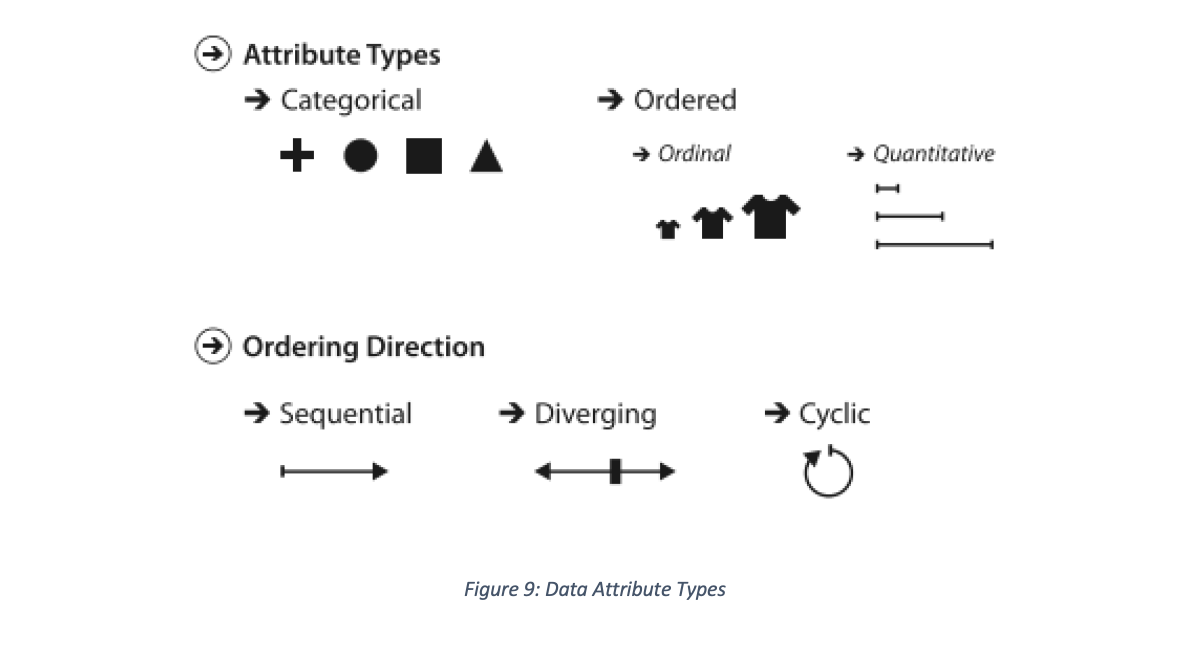
In much the same way, data attributes come grouped as categorical and ordered with ordering direction illustrated in Figure 9 below (Munzner 2014):
MAPPING VISUAL TO DATA ELEMENTS
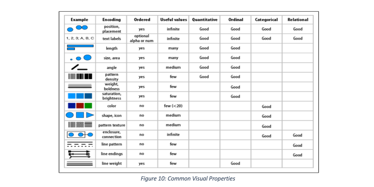
It is important to consider, of the visual element, the natural ordering and the number of distinct values readers can identify, in choosing visual elements to represent data values. In respect to human perception and processing, natural ordering refers how the human brain without any prejudice considers visual elements like positions, length, line thickness or weight to be naturally ordered and that given a lot of colours (distinct values), it would be difficult to tell them apart. Figure 10 provides properties of common visuals to consider as a guide when deciding encoding visual properties to data elements (Iliinsky, Noah; Steele 2011)
As visual properties that can be encoded overlap in what data type it can represent, Figure 11 provides a grouping that can also serve as a guide (Iliinsky, Noah; Steele 2011)

The designer is encouraged to use the suggested encoding of ordered and categorical channels and their attributes by (Munzner 2014) as illustrated in Figure 12 below for effectiveness

The colour brewer (Brewer 2017), provides a guide for encoding sequential, diverging and categorical visual elements

VISUALIZATION PITFALLS TO AVOID
In the design of visualization, the focus is to have readers understand pre-attentively, therefore it behoves on designers to avoid common errors that often lead to attentive processing of visuals. These include:
- Design for recognition instead of recall (Ware 2004). Any design that requires the reader to remember something for understanding falls under this category. So is, design that causes mental calculations to understand
- Colour is not naturally ordered, when had pressed to use colour in elevation and heat map, etc. varying luminance (brightness) along one or two axes is advised (Iliinsky, Noah; Steele 2011)
- Arranging the data poorly and adding unnecessary design or decorative features also referred to as chart junk or graphical paraphernalia (Few 2006)
- Maximise the core of the graphic supported by data (data ink) and remove non-data or redundant data
- Maximise data density which is the number of data entries per area of graphics (Dykes, Jason; Slingsby 2017a)
- Increase graphical integrity by reducing the lie factor – ratio of the size of effect shown in graphic to the size of the effect in data (Tufte 2013)
“Thirteen common mistakes in dashboard design” has been identified (Few 2006) and presented below:
- Exceeding the boundaries of a single screen
- Supplying inadequate context for the data
- Displaying excessive detail or precision
- Choosing a deficient measure
- Choosing inappropriate display media Introducing meaningless variety
- Using poorly designed display media Encoding quantitative data inaccurately
- Arranging the data poorly
- Highlighting important data ineffectively or not at all
- Cluttering the display with useless decoration
- Misusing or overusing colour
- Designing an unattractive visual display
To efficiently utilize visualization to communicate insight clearly and precisely, “graphical displays should:
- show the data
- induce the viewer to think about the substance rather than about methodology, graphic design, the technology of graphic production, or something else
- avoid distorting what the data have to say
- present many numbers in a small space
- make large data sets coherent
- encourage the eye to compare different pieces of data
- reveal the data at several levels of detail, from a broad overview to the fine structure
- serve a reasonably clear purpose: description, exploration, tabulation, or decoration
- be closely integrated with the statistical and verbal descriptions of a data set” (Tufte 2013).
BUSINESS DASHBOARD
“A dashboard is a visual display of the most important information needed to achieve one or more objectives; consolidated and arranged on a single screen so the information can be monitored at a glance” (Few 2006). It is likened to the dashboards on cars showing indicators for important processes taking place at various components of the car; such as brake fluid, speed, seat belt, distance covered and whole lot more.
In business, dashboards serve many a function including strategic, analytical or operational purposes (Few 2006). Figure 14indicates the types of business dashboards, type of control and decision as well as the structure it takes.

KEY PERFORMANCE INDICATORS (KPI)
For business dashboards to play strategic, operational or analytical roles business data is used from which performance is monitored using key performance indicators (KPI) metrics. “KPIs are quantifiable metrics which reflect the performance of an organization in achieving its goals and objectives. KPIs reflect strategic value drivers rather than just measuring non-critical business activities and processes. KPIs align all levels of an organization (business units, departments and individuals) with clearly defined and cascaded targets and benchmarks to accountability and track progress” (Bauer, 2004, p63). When properly designed, KPIs provide indication of deviations or adherence to targets.
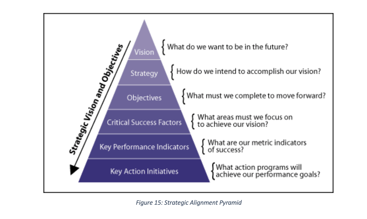
However, a number of factors account for not meeting the lofty ideals of KPI including creation of KPIs in isolation without their inter-relationships, gap in tacit knowledge of business analyst against KPIs as well as inconsistencies between business strategy and the KPIs (Maté et al. 2017). To avert this, the strategic alignment pyramid (Bauer 2004a) is used to translate business vision into KPIs and key action initiative as illustrated in Figure 15 below:
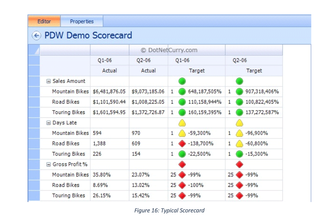
SCORECARDS
Scorecard integrated dashboards presents another way of meeting the ideals of KPIs, of monitoring the health of business in alignment with its strategic mission. This is because the use of scorecard combine KPIs with contextual information that leads analyst to the root cause of deviations in meeting set targets (Maté et al. 2017). A scorecard provides “fast but comprehensive view of the business” and a “starting point for improved managerial performance” (Kaplan and Norton, 1992, p. 71) cited in (Perkins et al. 2014). Often referred to, as Enterprise Dashboards, Balanced Scorecards, Performance Dashboard or KPI Summary, different businesses approach its design as varied as different technology platforms and strategy permit; a typical scorecard shapes up as below:
REFERENCES
Dykes, Jason; Slingsby, A., 2017a. A Summary of Tufte’s Theory of Data Graphics.
Dykes, Jason; Slingsby, A., 2017b. Information Visualization.
Few, S., 2006. Information Dashboard Design: The Effective Visual Communication of DataC. Wheeler, ed., Sebastopol: O’Reilly.
Iliinsky, Noah; Steele, J., 2011. Designing Data Visualizations, Sebastopol: O’Reilly.
Munzner, T., 2014. Visualization Analysis and DesignTamara Munzner, ed., Boca Raton: CRC Press (Taylor and Francis Group).
Nazemi, K., 2016. Information Visualization, Switzerland: Springer International Publishing Switzerland.
Tufte, E.R., 2013. The Visual Display.
Ward, Matthew; Grinstein, Georges; Keim, D., 2015. Human Perception and Information Processing. In Interactive Data Visualization : Foundations, Techniques, and Applications. pp. 81–138.
